By Robert Hurt | March 11th, 2011
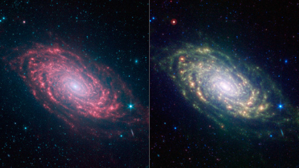
You may notice that every now and then we post multiple views of the same region of the sky but using different color schemes, like for the recent release of the Sunflower Galaxy, or Messier 63. Why not just go with one view? Have you wondered what the different color schemes show us?
I'm glad you asked! But be warned, this gets a little technical...
Often when we have data on a single object from multiple instruments we have so many bands of information it gives us a lot of options on how to present the data. Ultimately everything has to be remapped into red, green, and blue for us to see it, but when you have 5 or more bands of data choosing that mapping can be a tough choice. So sometimes when we can see different science using different color assignments we will release all of them.
For instance, in galaxies where we restrict ourselves to data only from the Infrared Array Camera (IRAC) we have 4 bands running from 3.6 to 8 microns. Starlight dominates at 3.6 and 4.5 microns so we map those to blue and green, which together give us a nice cyan for that part. The dust features at 5.8 & 8 microns are very similar so we blend those together to get the red display channel. This gives a lovely view of galaxies where the contrast between the cyan stars and red dust really jumps out, like in M63.
In fact we also employ another technique in these galaxies that astronomers call "continuum subtraction." Basically the 5.8 & 8 micron channels mostly show dust features, but some starlight is there as well. To really highlight just the dust, we can subtract out the contribution from the starlight (using the 3.6 micron data) leaving just the dust. This technique is commonly used when astronomers are trying to separate specific spectral features from the so-called "continuum" emission from stars. The resulting image give us nice, sharp dust features that would otherwise get washed out a little, especially in the nucleus of the galaxy.
However, for a lot of galaxies we also have dust data at 24 microns from the MIPS instrument. This dust is primarily glowing from the thermal heating from nearby stars and really gets bright around where stars are forming. To incorporate this into the image we put it into the red channel. This bumps the IRAC 8 micron channel over to green, and 4.5 micron over to cyan.
The resulting image has the starlight showing up as a deeper blue, and the dust lanes ranging from green to red. Cooler dust takes on a green/yellow hue (it shows up at both 8 & 24 microns), while the hottest dust pops out as orange-red (brightest at 24 microns). Now we can see how the regions of star formation fit into the overall dust distribution in a galaxy. Pretty cool, isn't it?
Of course there is a trade-off. The combined IRAC-MIPS image looks a little fuzzer than the IRAC image because the 24 micron data isn't as sharp. This isn't a problem with the telescope, just a consequence of basic physics. A telescope's resolution is actually determined by the ratio of the size of its mirror to the wavelength of light it is observing. The MIPS 24 micron channel has a wavelength that is 3 times longer than the IRAC 8 micron channel, so naturally it will appear less sharp to Spitzer. That's why the Herschel Space Telescope, which works at wavelengths up to 500 microns, has a much bigger mirror than Spitzer.
So on one hand we have one image that is sharp and shows the overall distribution of dust with good contrast, while we have another that isn't as sharp but lets us easily see where stars are forming. By showing both we can tell more of the story, as well as show that there's more than one way to visualize a galaxy!
 Three NITARP Newsy Items
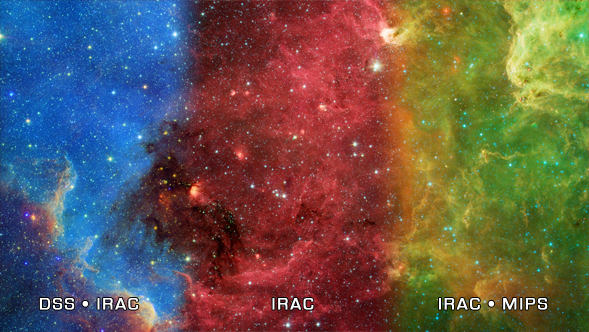 North America Nebula in IR