Space Telescope photo
SHARE

In a shared office on the southern edge of Caltech’s campus, Robert Hurt and Tim Pyle are making art out of science. Armed with the industry standards–Photoshop, Illustrator, After Effects–it’s their job to break down the Spitzer Space Telescope’s complex scientific data into visualizations that are accessible and meaningful to the average viewer. But their artistic challenge is unique: Human eyes have never seen the objects they are creating.

httpswww.popsci.comsitespopsci.comfilesimport2013importPopSciArticlesnasa-pullq4.jpg

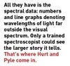
Spitzer’s infrared instruments return reams of data to Earth as the orbiting observatory gathers light from far reaches of the universe, light that is invisible to the naked eye. Imaging instruments capture some visual data that specialized software can cobble together into composite images, but often Spitzer’s most interesting discoveries come from regions of space too distant or obscure for the imagers to capture. In those cases, all they have is the spectral data; numbers and line graphs denoting wavelengths of light far outside the visual spectrum. Only a trained spectroscopist could look at that data and see the larger story it tells.

That’s where Hurt and Pyle come in. Dr. Hurt is the Spitzer Science Center’s visualization scientist. Along with animator and graphic artist Tim Pyle, it’s his job to convert the cascading numbers and EKG-like line graphs that are the core of Spitzer science into images and animations that make sense to those of us who can’t see the remnants of a supernovae or a planetary debris ring in the data. Those illustrations and animations end up everywhere from press releases to educational materials to the History Channel.

Click here for an annotated gallery of Hurt and Pyle’s all-time favorite illustrations.

“We take data and try to make it visually interesting,” Hurt says of their work, which includes turning invisible light into colors that we can see, while employing a restrained brand of artistic license that must constantly balance hard science with aesthetic appeal. “You have to make these things interesting enough so someone will read your story. If your image is flat and dull, no one is going to read the text.”
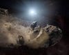
<a href="https://www.popsci.com/technology/article/2010-08/best-jobs-science-nasa-concept-illustrators-turn-raw-data-art/">Click here for an annotated gallery</a> of Hurt and Pyle's all-time favorite illustrations.

Buckyballs in Space

Click here for an annotated gallery of Hurt and Pyle’s all-time favorite illustrations.

Doing so can be easier said than done. For instance, Spitzer’s recent discovery of buckyballs in space–rare 60-atom carbon molecules that had never before been seen outside of Earth–provided them with an opportunity to attempt a stunning illustration: complex atomic structures backlit by a beautiful planetary nebula. But by a less romantic description, the task was to visually render individual molecules floating loose in space some 6,000 light years away.

“A lot of the stuff we’ve never seen, and that opens up creative choices,” Hurt says. “The difference between us and a Hollywood blockbuster is that we have to keep it tied to the science as closely as possible.”

To do so, the duo plays to each other’s strengths. Hurt, a trained astronomer with a Ph.D. in Physics from UCLA, works closely with the principal researchers at Spitzer to define the scientific constraints for a given illustration. Pyle then begins making the artistic decisions that will get them from raw data to visualization.

In the case of the buckyballs illustration, the constraints were fairly straightforward; they needed to show that the molecules are in space, that they have a unique and interesting molecular structure, and that they are associated with a faraway planetary nebula. But beyond that, the science didn’t lend very many cues as to how a visual depiction should come together. After all, a buckyball is very tiny, and the universe is very big.

“What looks cool and what’s real don’t always line up,” Hurt says, “but generally we can find a compromise.” For the buckyballs, Pyle turned out a simple but mesmerizing rendering of the buckyballs magnified in the foreground to relay the idea that they are tiny (in this case, microscopic) relative to the vast expanse of space behind, which is slightly out of focus to drive home the sense of perspective. The cloud of gas and dust behind the buckyballs isn’t actually the same nebula where the buckyballs were discovered, but rather a Hubble Space Telescope image of a nearby nebula. Spitzer’s composite image of the actual cosmic backdrop simply didn’t convey the crisp, dazzling canvas that the data described.

When images alone can’t capture the full significance of the data, Hurt and Pyle turn to animation to breathe further life into their work. Buckyballs, for instance, have a unique spherical structure of atomic bonds that create a hexagon-pentagon structure (like that of a soccer ball) with atoms residing at the vertices. That structure is flexible rather than rigid, so the molecules jiggle like Jell-O as they move about.

Hurt and Pyle did a few animated test renders of these molecular vibrations just to see what they looked like in motion. Not only did the other researchers at the Jet Propulsion Lab like what they saw, but they realized that to their knowledge no one had done a really good buckyball animation before. These are the kinds of stories Hurt and Pyle tell best. Readers could pore over academic papers about the physical properties of buckyballs, but a 16-second animation describes their motion more easily and arguably more thoroughly.

Once complete, their work goes directly into the public domain via NASA, and it often turns up in unexpected places. Aside from the venues one might expect to find detailed NASA artwork–their representations routinely appear on television series like the “The Universe” and “Known Universe”–they’ve spotted their work in a Microsoft graphics benchmarking program, in advertisements shilling everything from dental services to opera performances, and even tacked to the wall of the set of the television show “The Big Bang Theory.”

Hurt and Pyle don’t so much mind where their work ends up as long as it’s doing its job. Even if it’s in an ad for a dentist’s office tacked up in the D.C. subway, their work distills distilling Spitzer’s complex data into something we civilians can appreciate, stoking our interest in space science along the way.

“We’re just very interested in using imagery to bring scientific data to life,” Hurt says. “It’s a great educational calling.”

Visually telling the story of buckyballs – 60-atom carbon molecules that <a href="http://www.spitzer.caltech.edu/images/3215-ssc2010-06b-Space-Balls">Spitzer detected</a> for the first time in space earlier this year – wasn't exactly easy. Hurt and Pyle had to represent both the very large and the very small in the same frame, leading to the unique perspective seen here. "I really like how the buckyball renders came out, especially how each one is lit from its own bonds between atoms (as opposed to all of them being lit from an external light source, the way molecules are often rendered)," Pyle says. "The final result just looks cool...like some strange bio-luminescent space organisms."

Space Balls

Visually telling the story of buckyballs – 60-atom carbon molecules that Spitzer detected for the first time in space earlier this year – wasn’t exactly easy. Hurt and Pyle had to represent both the very large and the very small in the same frame, leading to the unique perspective seen here. “I really like how the buckyball renders came out, especially how each one is lit from its own bonds between atoms (as opposed to all of them being lit from an external light source, the way molecules are often rendered),” Pyle says. “The final result just looks cool…like some strange bio-luminescent space organisms.”
For a long time Saturn was hiding a <a href="http://www.spitzer.caltech.edu/images/2763-ssc2009-19c-Artist-s-Rendering-of-Saturn-s-Infrared-Ring">secret</a> that only an IR telescope like Spitzer could see: a giant ring – far larger than Saturn's other orbital debris rings – so diffuse that it reflected very little sunlight back toward earth, making it invisible. Spitzer's IR instruments can capture the heat radiation put off by dust particles in the ring, which starts some 3.7 million miles from Saturn and extends outward another 7.4 million miles. "It's not often you get to show someone something completely new about a planet as well-known as Saturn," Hurt says. "Doing an artist's rendering that is designed to look like an infrared image I thought would help people to better understand that this ring can only be seen in the infrared."

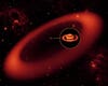
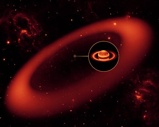
Saturn’s Secret Ring

For a long time Saturn was hiding a secret that only an IR telescope like Spitzer could see: a giant ring – far larger than Saturn’s other orbital debris rings – so diffuse that it reflected very little sunlight back toward earth, making it invisible. Spitzer’s IR instruments can capture the heat radiation put off by dust particles in the ring, which starts some 3.7 million miles from Saturn and extends outward another 7.4 million miles. “It’s not often you get to show someone something completely new about a planet as well-known as Saturn,” Hurt says. “Doing an artist’s rendering that is designed to look like an infrared image I thought would help people to better understand that this ring can only be seen in the infrared.”
"Who could resist the chance to show worlds smashing together, especially when the result is motivated by actual observation of the aftermath?" Hurt says. "This is the kind of imagery that will catch people's attention and hopefully draw them in to learn more about the science behind the artwork." This <a href="http://www.spitzer.caltech.edu/images/2713-ssc2009-16a-Planetary-Demolition-Derby">image</a> is actually a still taken from an <a href="http://www.spitzer.caltech.edu/video-audio/855-ssc2009-16v1-Planetary-Demolition-Derby">animation</a> the duo put together visualizing a Spitzer-captured collision between an object roughly the size of the moon and another body the size of Mercury. "What I really like about primarily the animation (and to some extent, this still) is the level of effects we incorporated: from the rippling, cracking planetary crust to the color of the fiery ejecta, we tried to include a number of subtle but accurate scientific points into one single animation," says Pyle. "And on the whole, I think we were successful."

When Worlds Collide

“Who could resist the chance to show worlds smashing together, especially when the result is motivated by actual observation of the aftermath?” Hurt says. “This is the kind of imagery that will catch people’s attention and hopefully draw them in to learn more about the science behind the artwork.” This image is actually a still taken from an animation the duo put together visualizing a Spitzer-captured collision between an object roughly the size of the moon and another body the size of Mercury. “What I really like about primarily the animation (and to some extent, this still) is the level of effects we incorporated: from the rippling, cracking planetary crust to the color of the fiery ejecta, we tried to include a number of subtle but accurate scientific points into one single animation,” says Pyle. “And on the whole, I think we were successful.”
"It's amazing to think that even today we know so little about what our own galaxy looks like since we are trapped in the middle," Hurt says. "This image provided a unique opportunity to work with many researchers and combine conclusions drawn from observations across the spectrum into a best-guess of what the Milky Way would look like from the outside. Realizing how much such an image would likely be used carried an extra responsibility to be as accurate as possible, even when combining different results that do not line up exactly with one another."

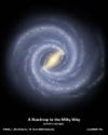
Mapping the Milky Way

“It’s amazing to think that even today we know so little about what our own galaxy looks like since we are trapped in the middle,” Hurt says. “This image provided a unique opportunity to work with many researchers and combine conclusions drawn from observations across the spectrum into a best-guess of what the Milky Way would look like from the outside. Realizing how much such an image would likely be used carried an extra responsibility to be as accurate as possible, even when combining different results that do not line up exactly with one another.”
Just because Hurt and Pyle have to stick close to the scientific data doesn't mean there's no room for interpretive creativity, and they're not above dropping in an Easter egg here and there. "<a href="http://www.spitzer.caltech.edu/images/1966-ssc2008-19a-Epsilon-Eridani-Double-the-Rubble">This graphic</a> illustrated a new discovery related to the Epsilon Eridani star system," Pyle says. "It's a cool news story in-and-of itself, and I like the semi-painted look of the final image. But I think it's even cooler because the Epsilon Eridani system is featured prominently in both Star Trek (it's the location of the planet Vulcan), and Babylon 5 (the Babylon 5 station orbits the third planet in the system). In fact, while developing this graphic, we snuck in an image of a shadow vessel – the main villain from Babylon 5. This artist concept has since been re-used &amp; reprinted by multiple outside groups, but so far no one seems to have discovered the shadow ship."

Searching for Sci-Fi in Epsilon Eridani

Just because Hurt and Pyle have to stick close to the scientific data doesn’t mean there’s no room for interpretive creativity, and they’re not above dropping in an Easter egg here and there. “This graphic illustrated a new discovery related to the Epsilon Eridani star system,” Pyle says. “It’s a cool news story in-and-of itself, and I like the semi-painted look of the final image. But I think it’s even cooler because the Epsilon Eridani system is featured prominently in both Star Trek (it’s the location of the planet Vulcan), and Babylon 5 (the Babylon 5 station orbits the third planet in the system). In fact, while developing this graphic, we snuck in an image of a shadow vessel – the main villain from Babylon 5. This artist concept has since been re-used & reprinted by multiple outside groups, but so far no one seems to have discovered the shadow ship.”
One of Spitzer's great scientific advantages is its ability to see even very tiny objects emanating IR in faraway regions of space, giving researchers insight into the very small even as they peer across very large spaces. Pyle gives a less complicated but equally valid reason for liking this particular rendering. "This is a favorite from a visual standpoint," he says. "I think the crystals turned out very pretty."

Seeding the Universe with Planets

One of Spitzer’s great scientific advantages is its ability to see even very tiny objects emanating IR in faraway regions of space, giving researchers insight into the very small even as they peer across very large spaces. Pyle gives a less complicated but equally valid reason for liking this particular rendering. “This is a favorite from a visual standpoint,” he says. “I think the crystals turned out very pretty.”
"There's something eerie about this one that appeals to me, both in story and image," Pyle says. "The gravity from a distant white dwarf is ripping apart an asteroid that happened to wander a little too close. In general, I enjoy creating the artist concepts that feature massive destruction (what does this say about me?), but this one stands out even above the others on my list of favorites. Something about it just feels so sad, cold and lonely."

A Dead Star Shares its Fate with an Asteroid

“There’s something eerie about this one that appeals to me, both in story and image,” Pyle says. “The gravity from a distant white dwarf is ripping apart an asteroid that happened to wander a little too close. In general, I enjoy creating the artist concepts that feature massive destruction (what does this say about me?), but this one stands out even above the others on my list of favorites. Something about it just feels so sad, cold and lonely.”
"This was a fun artist concept to develop because it was so wildly different from our usual work," Pyle says. "Our science writer Whitney Clavin came up with the concept of writing a news story from the perspective of the Spitzer telescope itself (assuming the telescope could talk), and needed a whimsical graphic to support it." Mission accomplished.

Spitzer’s Sense of Humor

“This was a fun artist concept to develop because it was so wildly different from our usual work,” Pyle says. “Our science writer Whitney Clavin came up with the concept of writing a news story from the perspective of the Spitzer telescope itself (assuming the telescope could talk), and needed a whimsical graphic to support it.” Mission accomplished.