By Robert Hurt | August 2nd, 2010
In a recent review of a space imagery exhibit at the National Air and Space Museum, the New York Times reviewer goes on an odd tangent half-way down the page, seemingly taking exception to the way astronomical images from Hubble (and presumably other missions like Spitzer) are produced. Referring to the colors as "phony" and stating that "Many are colorized far more radically than any 1930s movie," he makes it sounds like something dodgy may be going on...
Trust me, it's not.
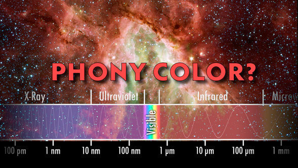
It seems that astronomy is still being haunted by misconceptions about how color is managed when dealing with telescopes that see light differently from the human eye. It doesn't help that so often we read misleading terms like "false color." I personally dislike that term a lot because it implies something is being misrepresented.
Everything we ever learn about color in school, or even art school, is really tied to the long and semi-aribitrary evolution of the human eye. The only fundamentally special thing about the "primary" colors of light (red, green, and blue), is that they correspond to the parts of the light spectrum our human eyes happen to be able to distinguish. Lots of animals on the planet see different slices of the light spectrum than we do, even into the infrared and ultraviolet. That falls beyond the human-centric definition of "visible" light!
Entire books can (and have) been written about how we see colors across the electromagnetic spectrum, and how we can shift information from other parts into the familiar red, green, and blue so that we can experience them with our own eyes. A good analogy might be translating text from a language you can't read into one you can. The translation isn't "phony" because it isn't the original text (which would be meaningless to you), it has merely remapped the ideas into something you can wrap your brain around.
In the same way, the colors we see in astronomical images like the ones here on the Spitzer website are very much real colors, representing fantastic complexities of light across the spectrum. They've just been translated for your eyes, remapped into red, green, and blue.
That's very different from the task of "colorizing" a black and white movie. An artist does that by arbitrarily picking colors for everything in the scene and painting them on. Those colors may have nothing to do with what colors were actually there... that process truly could be described as "phony."
The Spitzer website would be kind of dull if we just showed you infrared light the way your eye sees it. There would be a lot of black, blank pictures, since it's not visible. Well, visible to us anyway. Somewhere on some other planet, there might be some infrared-viewing aliens debating over the colors in images that their astronomers observed in our visible light spectrum. Let's hope they don't conclude that the colors we can see are phony!
By the way, the exhibit in the review really does sound spectacular. It may be worth checking out if you are in the Washington D.C. area!
 Happy 7th Birthday, Spitzer!
 NASA Spacescapes on your Desktop